Remember that the window décor takes up a large area and so it has a significant impact on the feel of the entire room. Therefore, it is always a good idea to spend some time matching the colour of the window decoration to the colour-scheme of the interior. Monochrome, harmonious or contrasting combinations are the most impressive ones.

MONOCHROMATIC COMBINATIONS
For such a composition to not seem too monotonous, shades should be skilfully combined (from the lightest to the darkest one, and in the case of white - broken with a touch of a different colour); textures of materials and their gloss should be varied, too. If the furniture upholstery is smooth, the blinds should be made of a fabric with a more distinctive texture (e.g. unevenly woven or looped) or decorated with a delicate two-colour floral or geometric pattern, like light stripes. The carpet, on the other hand, should be shaggy, and the cushions on the sofa made of fabric with a contrasting texture that reflects light a little bit differently.
HARMONIOUS COMBINATIONS
They are created with colours that are adjacent to each other in the solar spectrum, with gentle transitions from one colour to another like the combination of shades of yellow and orange, red and purple, blue and green, green and yellow. If the walls are painted yellow, choose orange blinds and repeat their colour in other accessories, for example on cushions, tablecloths or vases. Try using mid-tones (like orange turning chestnut) instead of pure shades and as a result you will not only be enjoying a room which will exude an air of calm and elegance but also not get bored with it too quickly. A similar effect can be achieved by using whitened shades called pastels.
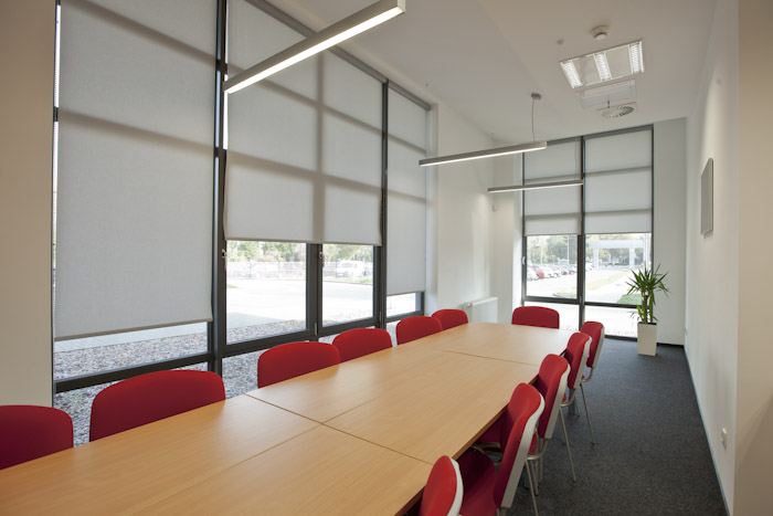
CONTRASTING COMBINATIONS
The tonal contrast is achieved by combining the lightest with the darkest colours: white with black, purple or navy blue, or black with yellow. Such compositions are so expressive that the remaining elements of interior design, including furniture, into the background. Using one of these colour pairs, even people with little experience are able to create a very attractive interior. Even on a very modest budget. Contrast colours, however, should not be used in equal proportions as it may create the impression of flickering, due to the fact that our eyes are not able to focus simultaneously on both colours. All this can be avoided by properly balancing the proportions with one colour dominating and the other complementing it.

If the walls are painted white, choose black (or black and white) blinds and upholstery of some furniture. Both colours can also be repeated in accessories - cushions, decorative dishes, etc. New blinds in the window, a few cushions on the armchairs and sofa, a rug under the coffee table are the cheapest and the fastest way for a make-over of a room we are bored of. However, they cannot be things chosen on a whim. They should have something in common – why not start with a colour scheme? When properly selected, it will work wonders! Our advice for those inexperienced in interior design on how to create successful colour compositions is not to be afraid of experiments and follow the rules developed by experienced decorators.